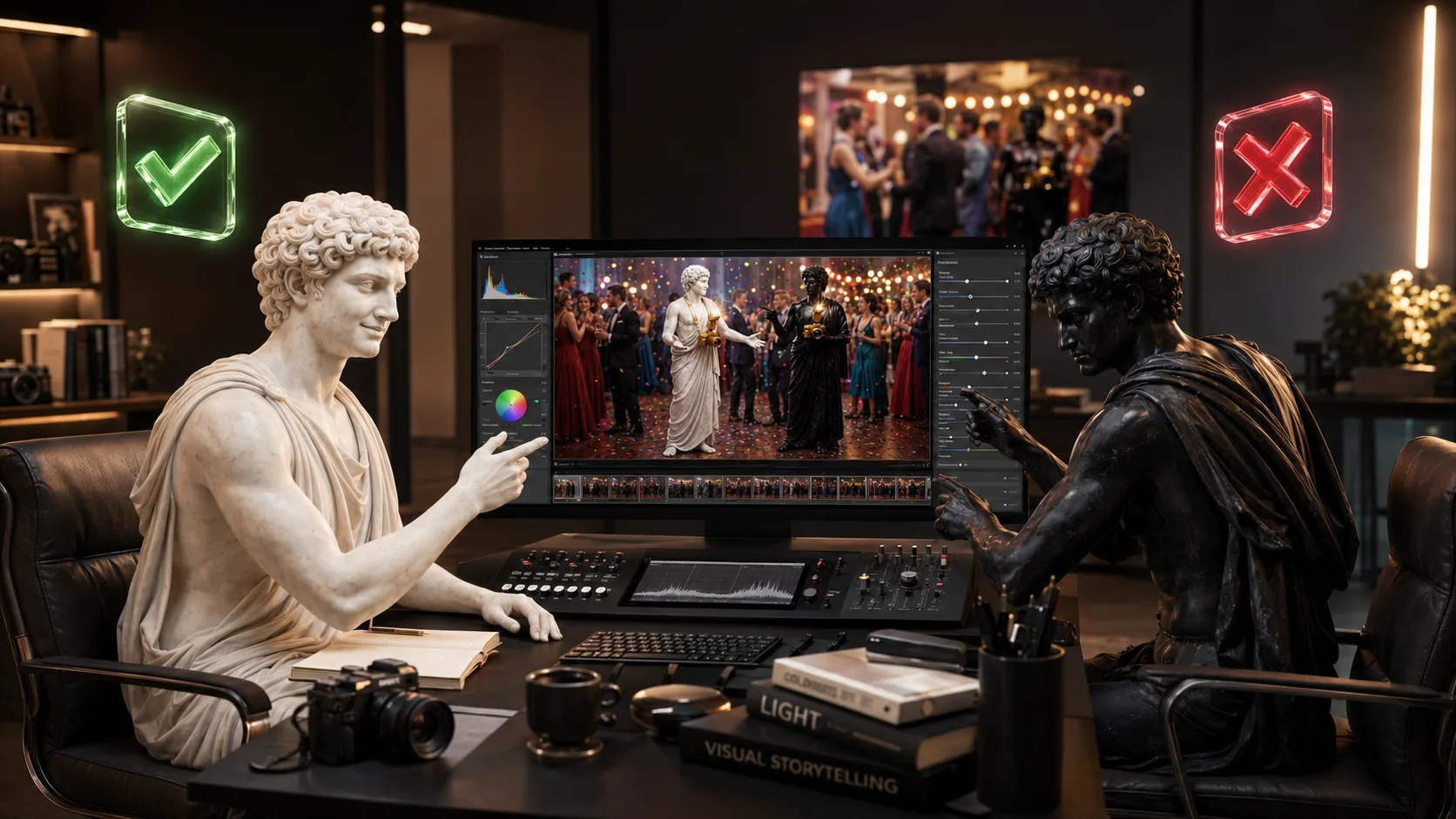
A good event photograph can survive imperfect settings. It has a harder time surviving an editor who keeps pushing after the moment already looks right. Too much colour, contrast or rescue work can make a real celebration feel artificial—and make the client wonder where their event went.
The Client Already Chose the Colour Palette
Before you opened Lightroom, the client had already made hundreds of visual decisions. They chose the venue, clothing, flowers, cake, balloons, lighting and decor because those details felt like them. When an edit turns warm skin orange or a quiet blue room electric, it replaces those decisions with the photographer's sliders.
Use this finishing standard: the edit should feel subtle, accurate and consistent. If one of those three disappears, the photograph is probably moving away from the event rather than closer to it.
Protect Faces Before You Chase a Style
Faces come first. Protect accurate skin tones as if they are sacred. A fashionable grade is not worth much if the guest looks sunburnt, grey or strangely tanned. Correct exposure and accurate colour give the client somewhere familiar to stand; style can then sit gently on top.
- Correct the white balance before adding a look.
- Check skin tones across several lighting conditions, not one hero frame.
- Keep saturation and contrast coherent from the room-wide photographs to the close portraits.
- Compare the edit with the real colours of the venue, clothing and decor.
- Stop when the moment feels preserved; do not keep moving sliders because they are available.
Let the Event Tell You How Loud the Edit Should Be
A colourful first birthday can carry a brighter palette because that energy was already in the room. A restrained formal dinner may need quieter colour and softer contrast. The event sets the volume; the edit should not arrive with a different song.
Before exporting: ask whether the client can still recognise their venue, their clothes, their skin and the atmosphere they paid to create. If the answer hesitates, pull the edit back.
Build Taste Before You Build Presets
When you do not yet trust your eye, gather references instead of compensating with intensity. Save magazine photographs, Pinterest boards and photographers whose clients resemble the people you want to serve. Notice the colour, contrast, texture and mood you return to. A signature style grows from repeated taste—not from pushing every slider to prove that an edit happened.
Less is more because restraint protects more than the file. It protects the client's memory, your portfolio, your referrals and the quiet promise that you understood the room. For the deeper system behind accurate colour, culling, consistency and delivery, continue with the Editing & Delivery lessons inside Event Photography 101. 📘